Project Description
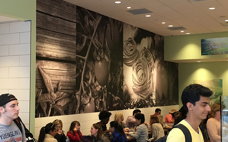
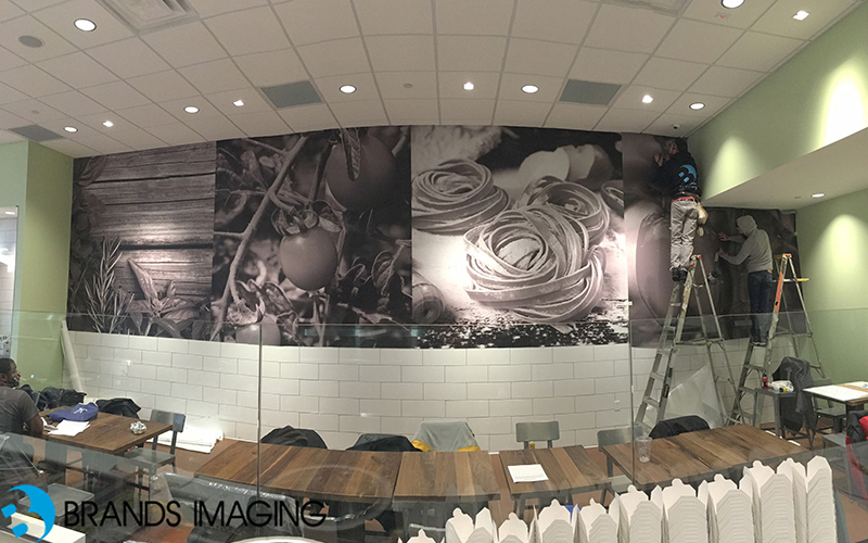
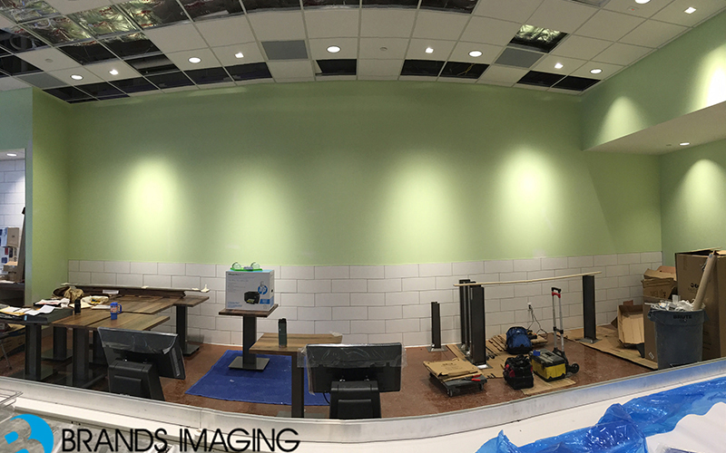
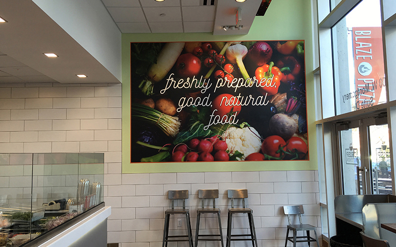
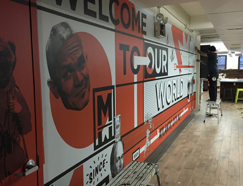
The design for Crisp Kitchen was meant to be exactly how it was executed: Fresh, clean, and vibrant in its own way. Our lead designer, Greg was charged with gathering the most accurate design collateral and photography to properly capture the right direction for these wall murals. This being the first location for Crisp Kitchen we really had to capture the store’s theme and have seamlessly translated into wall murals that fill the space but keep the brand on track. The installation process was swift and smooth, and our installers moved as quickly and efficiently as possible, to get the job done in a timely matter. For the murals, we used a 3MIJ180C and the corresponding matte over-laminate to reduce unsightly indoor glare.


